|
For this Task, I had to create a mood board for my Magazine. To create this mood board I used the software called 'PowerPoint', I used this as I found this was the easiest way in which I could arrange my collage of images I found.
On my Mood Board I included music from many different genres, such as:
I also added pictures of music logos, music magazine covers, musical events, quotes and album covers. I did this in order to gather ideas about the types of fonts, logos and camera shots that I could adapt in to my own work. I found this task particularly useful as it gave me and insight into a variety of themes and styles which music genres can present. For Example; Rock music having edgy and bold font. Overall, In my own work I have decided that my magazine genre will be a mixture of Pop, Rap and House, as many of these genres link together in many ways. I have picked 3 main music genres as it will grab the attention of many people. These 3 genres are very popular with teenagers and young adults, so therefore they can be my main audience. 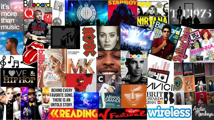
Music Genre And Images
I decided to create a video using Movie Maker, in order to show some images relating to the particular genre, as well as giving an example of a song from a variety of different genres in the background. In this video I give examples for the following genres;
- House - Rap - Indie - Rock - R&B - Pop
0 Comments
For this task, I was asked to get pictures of 5 music magazine covers and analysed them as part of my research towards my own magazine. I had to look at several different genres of music and also look at the elements which the front covers included. This was very useful as it gave me an insight in to what I will potentially include in my own magazine. It also helped me improve my analysing skills, this is beneficial as it will help me when I come to analysing my own work. 1. Genre: Pop / Hip Hop 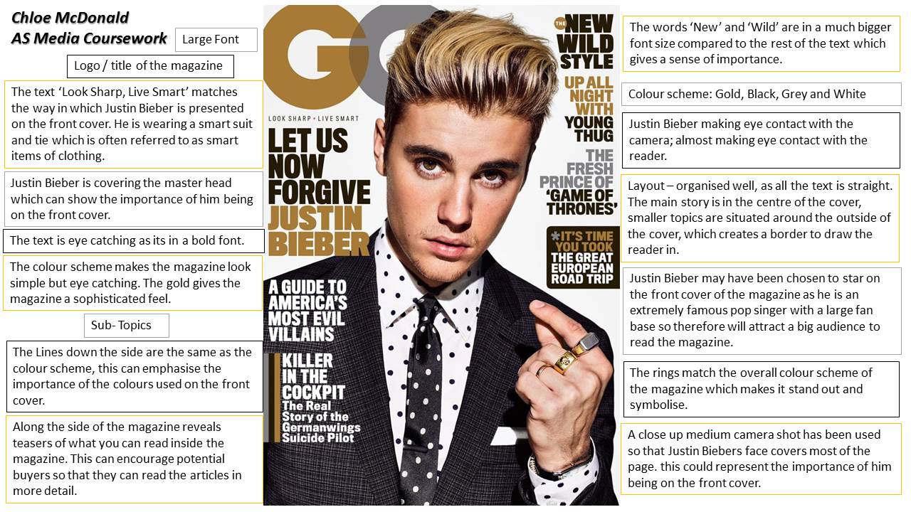 2. Genre: Rap / Pop 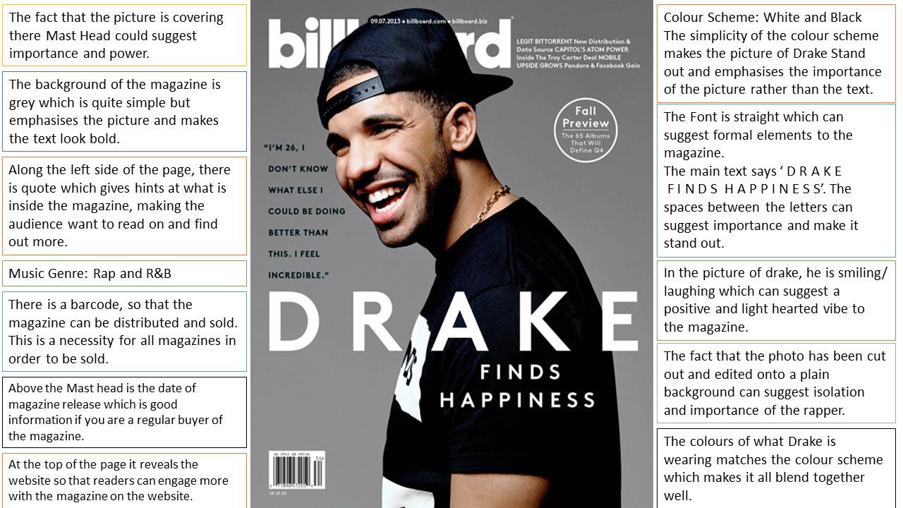 3. Genre: Rap / Grime / Pop 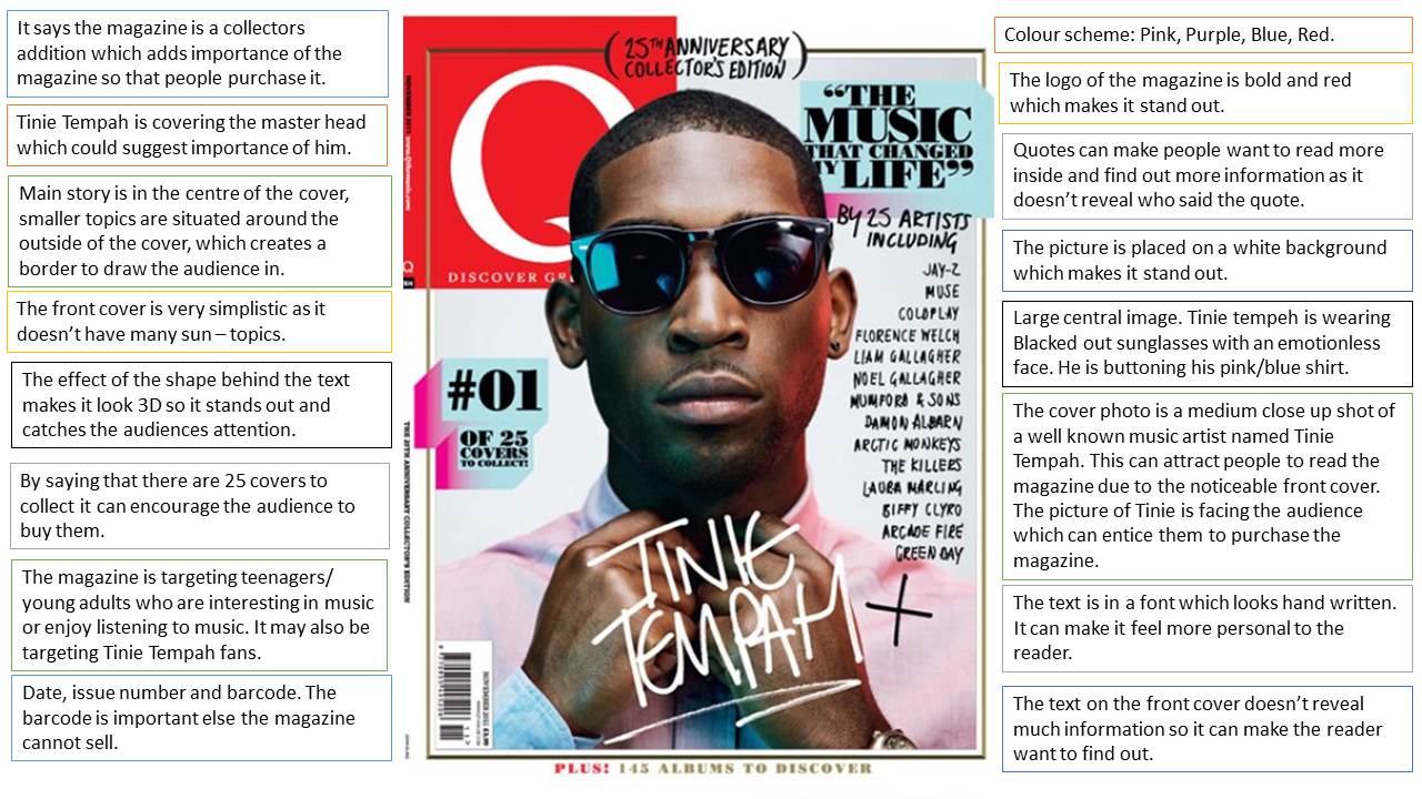 4. Genre: Rock / Heavy metal 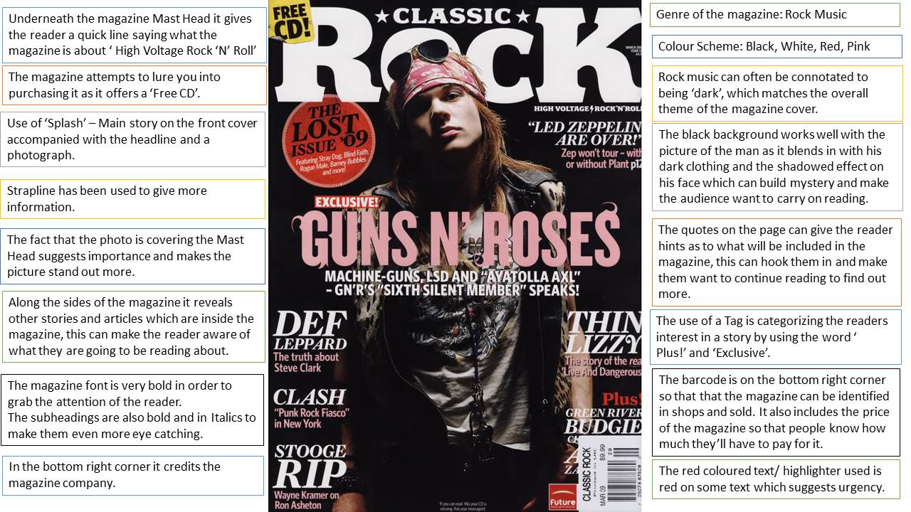 5. Genre: Indie Pop / Indie Rock 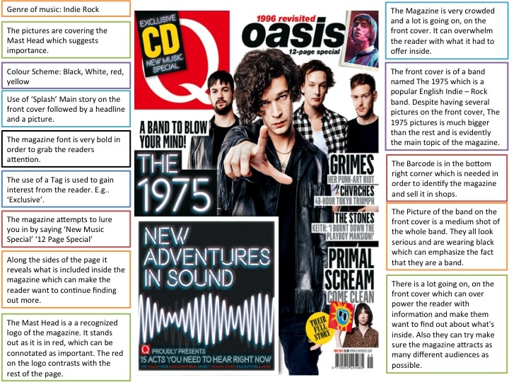
For this task, I had to research about the Codes and Conventions of Magazines. I used the free online website called 'Prezi' in order to put together a slide show of the important features of a magazine cover. This was very useful as it widened my knowledge about magazine covers and will help contribute when I come to analysing magazine covers as I will know more keywords.
This Website allowed me to put together a creative slideshow which will help me go back and revise over in the future. Contents Page Analysis For this task, I was asked to analyse my Contents Page. I explained all the conventions and features of Contents page and the reasons for choosing it. I used the software ‘PowerPoint’ so I could set it out in a way, which made it easy to label my magazine. 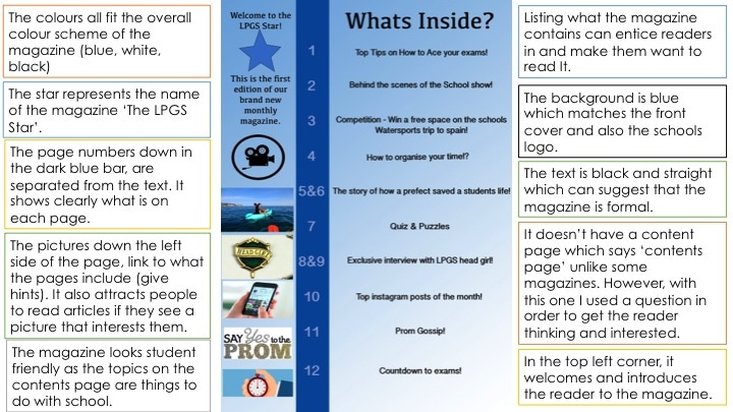 My Magazine cover Analysis For this task, I was asked to analyse my magazine cover. I explained all the conventions and features of my magazine and the reasons for choosing it. I used the software ‘PowerPoint’ so I could set it out in a way, which made it easy to label my magazine. 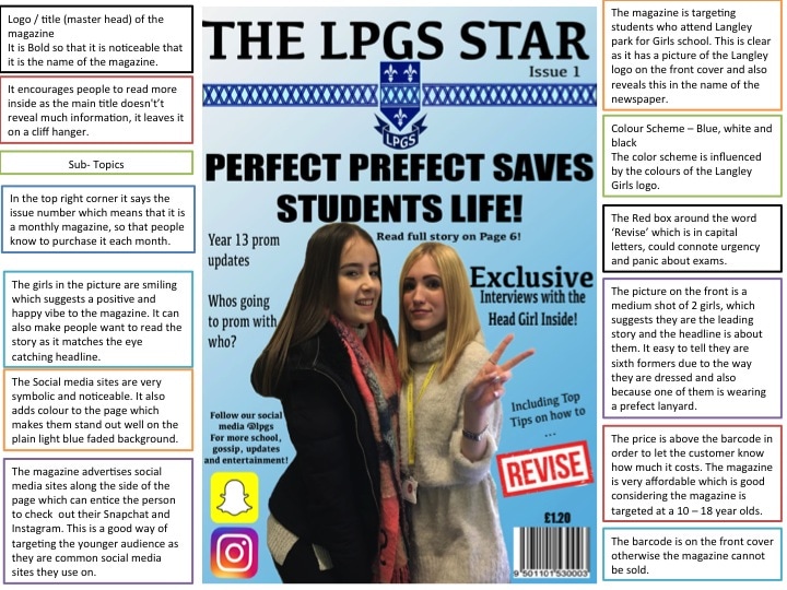 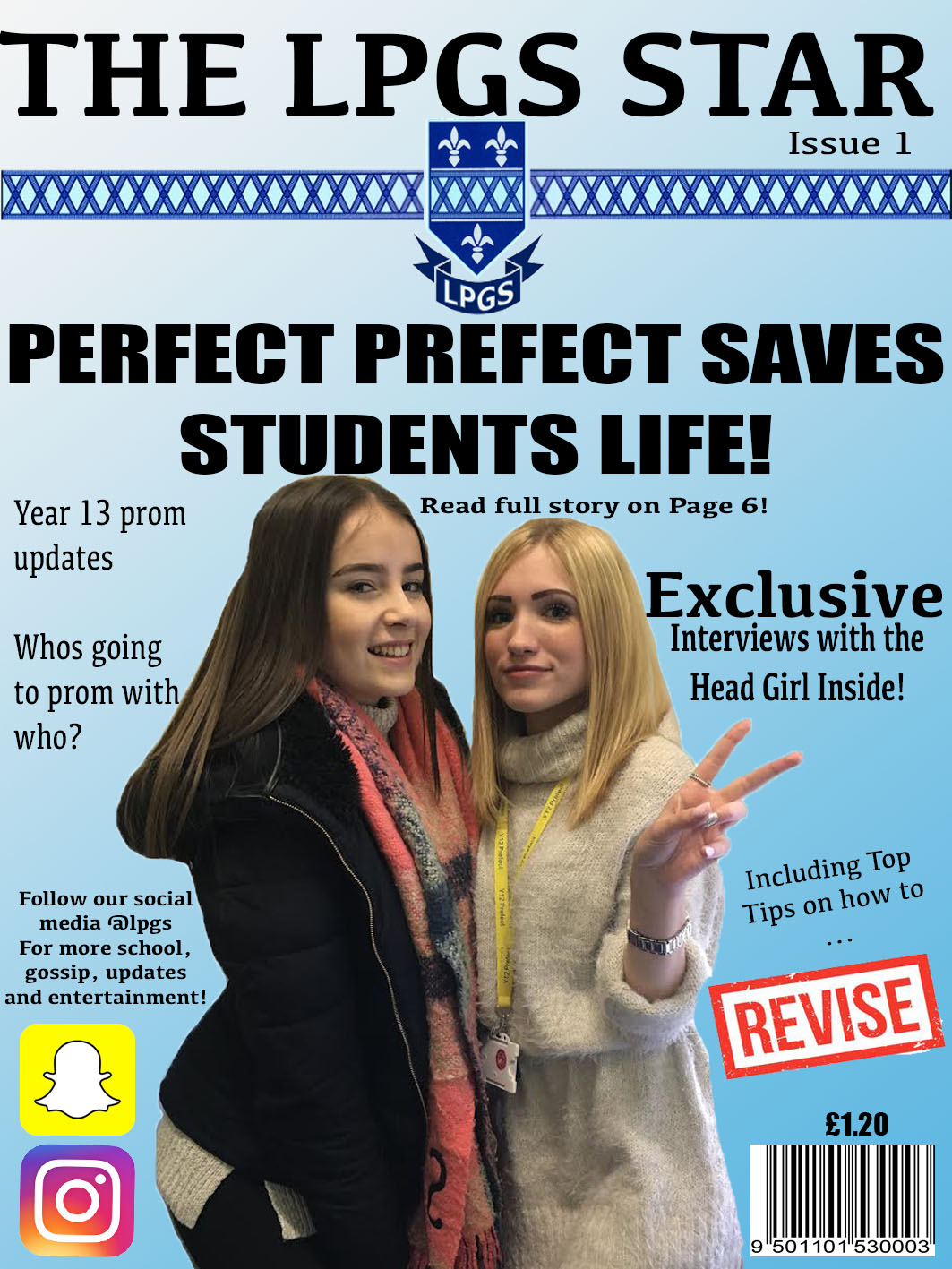 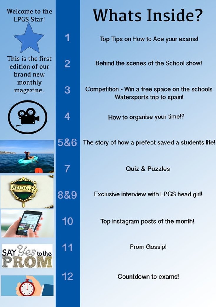 Research and Planning – Preliminary Task
The first task I had to do for my Coursework was to Create a school Magazine cover and contents page, to contribute towards my research and planning. The brief explained that it had to feature a medium close - up shot of a student on the front cover and also a master head along with some text. In order to create my magazine cover and contents page I used the software called ‘Photoshop’. I’ve never properly used Photoshop until now, so it helped me learn a lot of new skills, which I can use in the future. This software is good as it allowed me to be creative and do many things I didn’t know about previously, such as cutting out a picture using several different tools and then placing it on a background. For my magazine cover I decided to create a school magazine for Langley Girls school. I named it ‘The LPGS Star’ as I feel this is very simple but catchy. I based my colour scheme of the magazine around the colour of the school badge, which is blue and white. Therefore, I set my background of the magazine as a light blue fading into white. On the front cover, I wanted to make it eye catching so I took a medium close up picture of two of my peers. With this picture, I then used the magic wand and lasso tool to cut an outline around their bodies and then layer the new outlined picture on top of the blue background. I did this to isolate the 2 girls in the picture and make them stand out on a plain background for a greater effect. I created a master head to make it clear what the name of the magazine is called. I added a picture of the logo underneath the master lead to make it eye catching and make people who go to Langley recognise it and buy it. The front cover picture matched up with the lead story line, I did this so that It can make people want to read the fully story inside, as this is the main sell line. The sub headings gave hints at articles which appear inside the magazine. I made sure that all the text was black and straight so it was quite formal due to it being a school magazine. The overall age category of the magazine is 10-18 year olds, this is because it is only relatable for school students who attend Langley Girls school. I made sure I included social media accounts so that it can gain interest from the younger generation. This is an important platform of media, as this age group is more likely to use sites such as Instagram and Snapchat etc. For my contents page, I kept it relatively simple. I used the same background colour (blue and white) and the same font. I did this so I kept the same flow throughout otherwise It would of clashed and looked too messy if I changed the background or font. I stuck to the same kind of layout and theme throughout the magazine which made it look more professional. I sectioned the page number from the subject of the page to make it easy for the reader to understand. I then inserted pictures from the internet on the left side of the page to catch the eye of the reader and hint what is inside. Overall, I learnt a lot about different tools and editing techniques whilst creating my magazine cover and contents page. I used tools such as; lasso, magic wand, background colour, crop, move, text, font, layers, paint bucket and many more. |
AuthorChloe McDonald Archives
April 2017
Categories |
 RSS Feed
