|
I decided to create a mood board of some photo shots I found online that I like and could possibly try and recreate with my musical artist during the photo-shoot. I feel these shots are very magazine appropriate as they are medium shots, which are very common for magazine covers. These pictures show a lot of detail to clothing, make up and hair (the overall image). I feel that these factors of the appearance are really make or break whether it engages the customer to purchase the magazine. I particularly like the photo in the top left corner as they model is not directly looking at the camera, which gives a mysterious feel. I also really like the 3rd bottom picture as the model is sitting down which looks different to any pictures I've seen in my research.
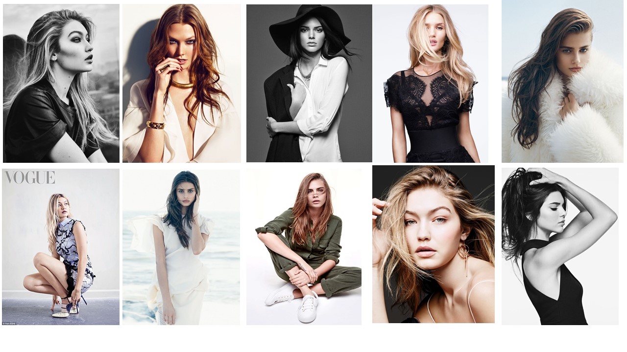
Mood Board - Inspiration from Real Music magazine Photoshoots
This is a Mood Board of Images which have been taken on a variety of photo shoot's for music magazines. I decided to create this mood board so I can gather ideas of what photo shots i will take during my photo shoot. These real media examples are important as all these musical artists are from the pop genre, which is the same as me. Therefore, I am using this to gain inspiration from what is currently out there catching customers eyes. On thing I noticed from looking at the photo shoot pictures is that, the majority of them are medium shots. So therefore, I need to make sure I take some medium shot photos as this is a key convention of magazine photos. 
Photo Shoot With Annabel
Below is a slideshow of the pictures I took of my close friend Annabel. I was lucky enough to work with her as she allowed me to take pictures of her for my magazine. I was really happy with the way the pictures turned out as we recreated some of the pictures above really well. I took loads of photos so I have many options to choose from to ensure I pick the right one.
Photo Shoot with Emily
I selected Emily as my second music artist, as I want her to feature somewhere on my contents page as a separate article. We took a variety of different photos during the photo shoot, which means I have a variety to choose from when it comes to construction.
I picked Emily, as she is in my media class so she had a good idea of what I am hoping to achieve with these photos. I also picked her as I feel she would really appeal to my target audience (teenagers and young adults). This is because she is 17 years old and she looks very glamorous. For the outfit, I decided on a black sparkly dress as I feel it looks very eye catching and attractive. I made sure her make up looked glamorous and stood out, as she was wearing red lipstick. GIF's Of My Favourite Photos From The Shoot
0 Comments
In order to come up with my magazine name, font and logo, I decided to first of all analyse a variety of logos associated with music or musical artists. I created a mood board to present the variety of logos which I found during my research. I found this a particularly useful way of gaining ideas for my own font and logo style.
I noticed that all the logos and fonts are simple however very effective. A common feature of a logo is bold, black and spaced out. This is a feature I may be able to interpret into my own font style. 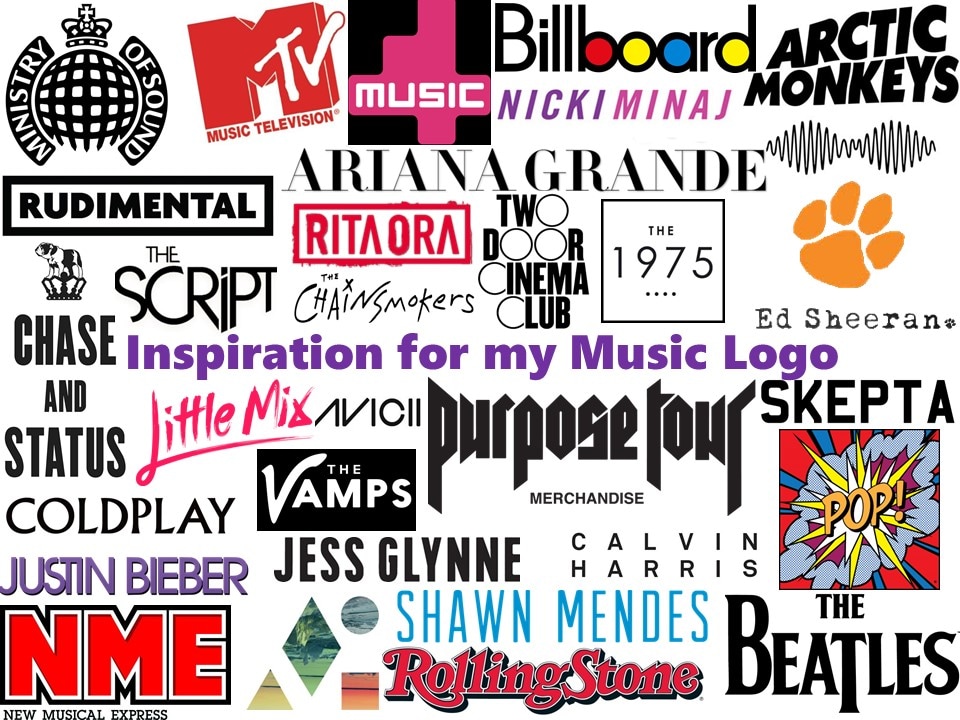
I then researched in further depth the features of a good logo/ font. I used PowerPoint to make a spider diagram to show my research. I found this helpful as it will give me a design brief of what my logo/ font need to be like, For example; Being simple but versatile.
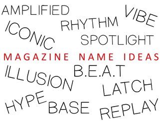
As Part of my own personal research, I wanted to brainstorm some ideas of potential magazine names. I wanted to do this so that it makes the selection process easier. I came up with several names, as seen to the right.
Overall, I came to the decision with the name 'HYPE'. I chose this name as I feel that it suits the pop genre very well as its short, snappy and uplifting. I could see this on a magazine as its an eye catching word. It is also a common word used by the younger generation, which is also a benefit as my target audience is Teenagers and Young Adults. Hype Logo/ Font
These are some designs of Logo/ Fonts for the name of my magazine. I created these using PowerPoint fonts and shapes. I also used a website called; http://www.1001fonts.com/
I was very happy with the way all of these designs have turned out, and will make the selection process much easier when it comes to deciding the final font for my magazine name. I made sure all the logos/ fonts were presented in black and white so that it stands out, looks clear, and can be easily changed to other colours if possible. I used the 'features of a logo' research above, in order to help me create a genre appropriate logo. These logos are versatile and have an instant impact. I feel as though they will be highly recognisable. Voting which logo is the most appropriate for a Pop Genre Music Magazine
I decided to ask people to vote which Logo design they liked the most and felt was most pop genre appropriate for a magazine.
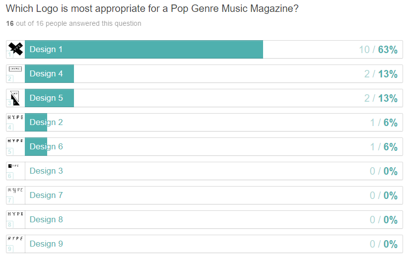
I used the website called 'Type Form' in order to conduct a survey question. The question I asked was 'Which Logo is the most appropriate for a Pop Genre Music Magazine?' I only asked one question as I only needed to find out which Logo is the most popular so I can use it for my magazine. I conducted this piece of research as it is finding out what the audience want to see, which can impact the success of the magazine, as customers from my target age group (Teenagers and Young Adults) will be more influenced to purchase and check out my magazine. The Results...
As you can see from the results below, there was a clear winner. I will be using Design 1 for my magazine as it came out most popular with the people I surveyed. I'm selecting this one as people were clearly drawn into the logo on the survey, as it got a majority of the votes (10/16 votes). so therefore, I feel it will help make my magazine front cover more eye catchy.
My Final DecisionThis is my final design for my Logo/ font for my magazine. I decided to choose this one as i feel it will be much more recognisable compared to other logos. I also chose it as it is simple but effective as the cross makes the text eye catchy. Even though the picture to the left shows it in black and white, it can be easily change to other colours. I noticed in my logo research that many logos are often black and white but can be changed to other colours. This may be an idea for the future. How I Created my Logo - Screen RecordingFor my featured article I have decided to write about a singer named 'Annabel' who is an up and coming pop artist, who started out releasing music covers on you tube. I created an interview which I will use on my double page spread. I chose to use an exclusive interview as my featured article as I feel interviews with big music artists really engage the audience especially audiences who are teenagers/ young adults, as they crave to find out the latest gossip about their favourite artists. |
AuthorChloe McDonald Archives
April 2017
Categories |
 RSS Feed
