|
I decided to brainstorm some ideas of things I could write about in the magazine as my main article. I used a website called 'Bubbl.us' in order to create a mind map of my ideas that I came up with. 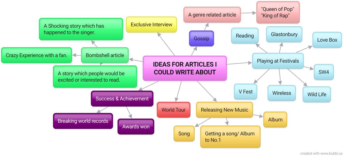
0 Comments
Front Cover Layout Ideas
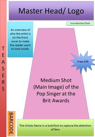
To the left is a layout I created to follow for my own magazine I make. I used power point to create this, as i feel it was easy to move the shapes around and label them to clearly plan out what I wish to do. I wanted to include many conventions of a magazine which I found out in my previous research. For example; a master head, logo, issue number/ date, barcode, teasers, main image, free gift, sub heading, and also headlines.
I feel that behaving a main image on the front cover with a plain background will make the image more effective and eye catching. The teasers on the left hand side will give hints as to what the magazine will include which will gain the readers interest and make them want to purchase and read in further depth. From my survey research that i I carried out earlier, I found that freebies have a massive influence as to whether a person purchases a magazine or not, so therefore i decided to include a freebie in my magazine to make sure my magazine appeals to my target audience and get as popular as possible. The barcode, Issue number and date, is good information to include on the magazine as readers may want to collect the magazines and want to know which issue the magazine is. My master head will stand out as it will be a recognisable magazine brand which will help to sell it and encourage people to pick it up and read it. It will be bold which will instantly attract attention to it. The coloured shapes also represent the fact that my magazine cover will be colourful. Colour is an important part of the 'pop' genre. Colourful magazines also catch peoples eye. Screen Recording Of How I Created My Layout
I created a short video using movie maker in order to show how I made my lay out. I screen recorded myself making the layout on power point as you can see from the video, as I wanted to show it in a way which was more creative.
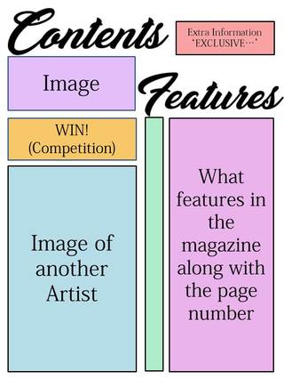
I was happy with the way that the plan turned out as I made sure I used many key conventions. Contents Page Layout Ideas
My contents page layout is very clear as to what it features as it gives a list. It is laid out in a simple way. On the right shows my inspiration from other magazines, which helped me when putting together my plan. I used powerpoint shapes and text in order to create my layout plan.
Screen Recording Of How I Created My Contents Page Layout
I created a short video using movie maker in order to show how I made my lay out. I screen recorded myself making the layout on power point as you can see from the video. After doing more researching into contents pages, I decided to make a few changes to my first draft of my layout (The Picture seen above). I did this as I feel it will make it look more professional and also uses more conventions of a contents page.
Double Page Spread Layout Ideas
To the left is a layout I created to follow for my own magazine I make. I used powerpoint to create this, as i feel it was easy to move the shapes around and label them to clearly plan out what I wish to do. I wanted to include many conventions of a magazine which I found out in my previous research.
I added a big picture of my artist as that is what the main article is based on. The article I will be writing will be placed to the right of it with the writers name and details above it, as I noticed a lot of magazines I looked at in my research did this. I also added a quote as it will draw the reader in, and make them want to read the whole article. 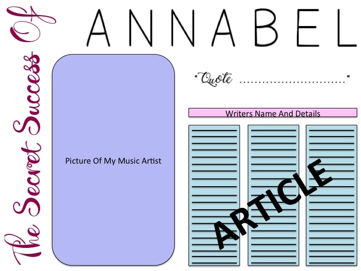
Screen Recording Of How I Created My Double Page Spread Layout
This is the video I made in order to show how I Created my layout plan of my Double Page Spread. i decided to show it using Screen recording in order to be more creative and show how I achieved this plan in greater detail.
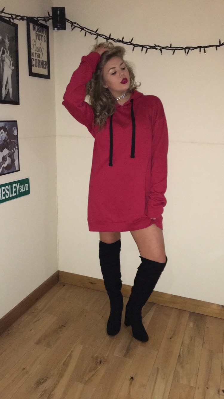
To make this plan, I used a software called Power Point, as I found it the easiest method to move around the shapes and change the sizes of the text/shapes. It didn't need to be perfect as it is only a draft, however it is clear to understand as I made sure I labelled it. I did make some changes to my first draft (as seen in the picture above) as I carried out more research and gathered more ideas in ways to make sure my double page spread looks as creative yet professional as possible. I am happy with the way it has turned out as I feel I have included many conventions of a Double Page Spread. Pop Genre Style / Inspiration For this task, I was asked to research costume ideas for my chosen genre. As my genres pop i decided to look at a a famous female pop singer named Zara Larsson. She is a very popular musician with an on trend fashion sense. As she is quite young, her audience tend to be people who are teenagers/ young adults. Her fashion sense is very on trend and she wears a lot of clothing items which are similar to the sort of things i see teenagers my age wear. I feel these outfits really reflect the pop genre due to them being very colour and bright. From my previous research of music videos, I come to the conclusion that bright colours is often associated with the pop genre. Below is a montage of 9 images i found on the internet of Zara Larsson. I feel her fashion sense is very unique and would catch peoples eye, which will make them want to read the magazine. It is very easy to get her look as many shops sell outfits very similar to hers, such as; Topshop. Miss Selfridge, Miss Guided, New Look, H&M, Boo Hoo, Primark, Berska. 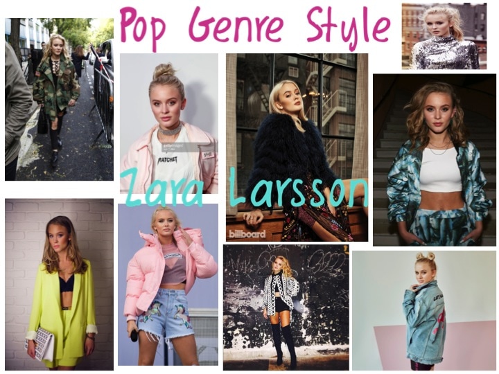 Costume 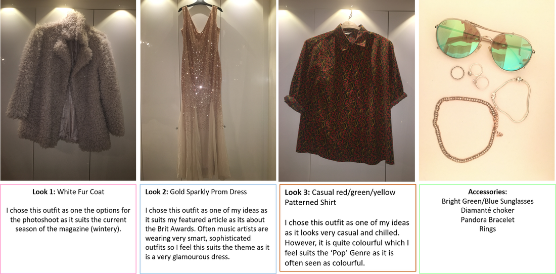 Make Up I have decided that my singers make up will have a 'Glitter Glam' make up look as I feel this will really make her stand out and look professional as it will attract people into the magazine. These make up looks seen below are ones that are very on trend, especially with teenagers and young adults and is seen all over the media. I feel that it will really catch the readers attention. I want to add a pop of colour to the make up look (such as a bold red lipstick) as I feel it will make the look colourful which is important as bright colours are often associated with the pop genre. 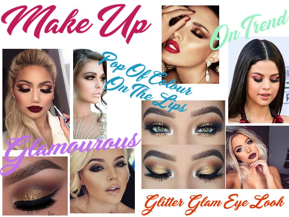
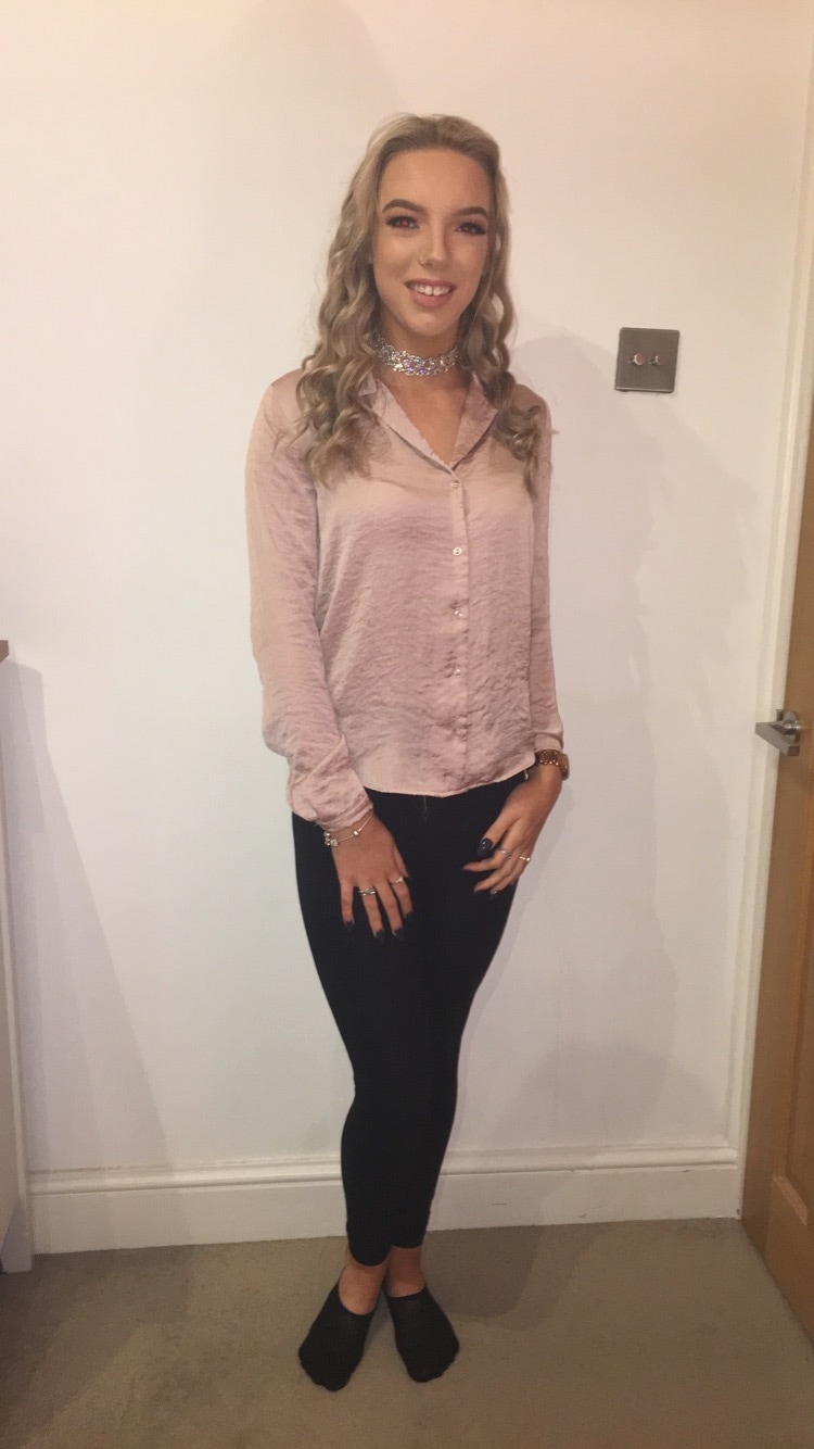
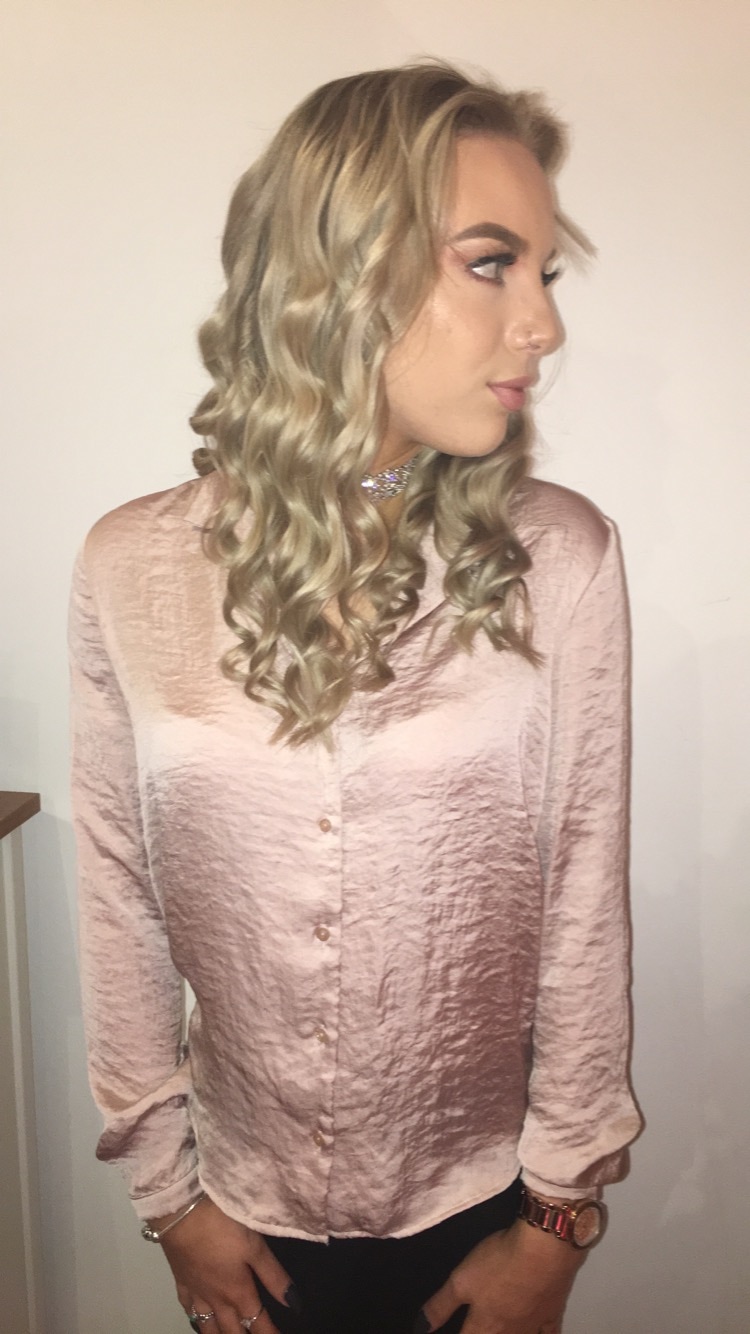
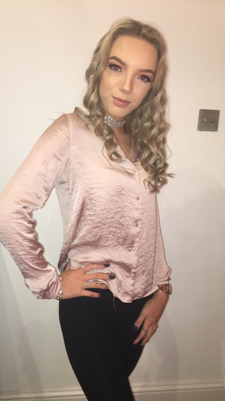
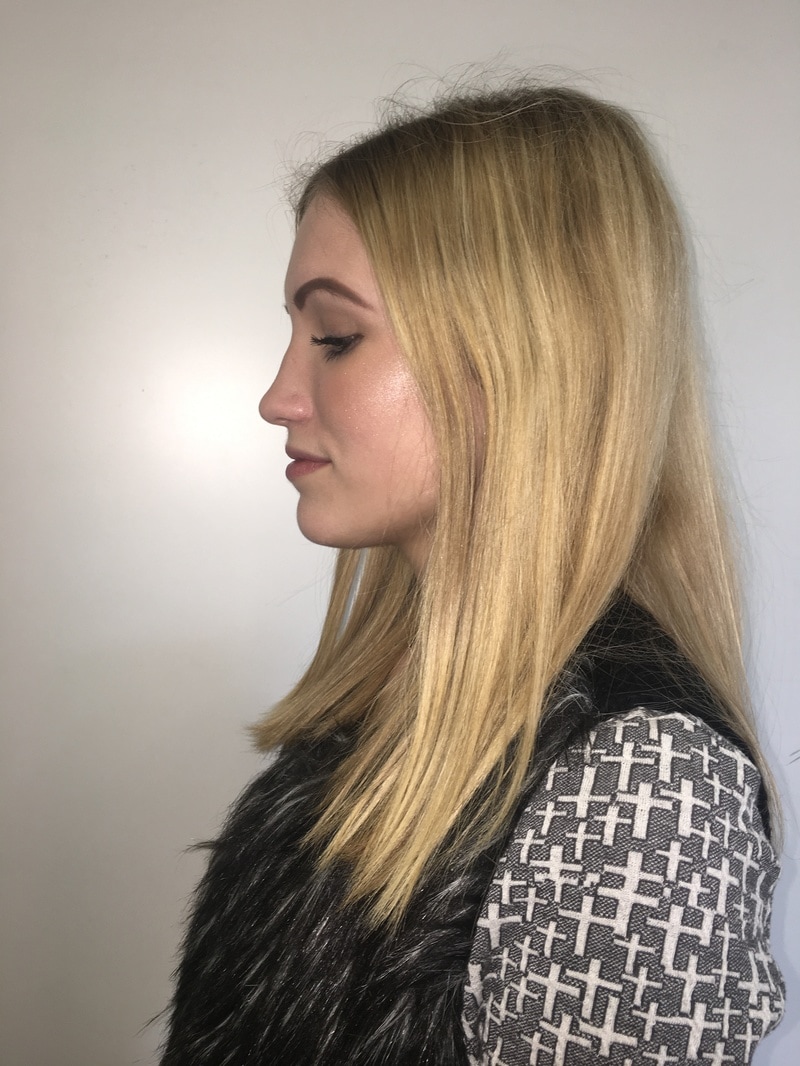
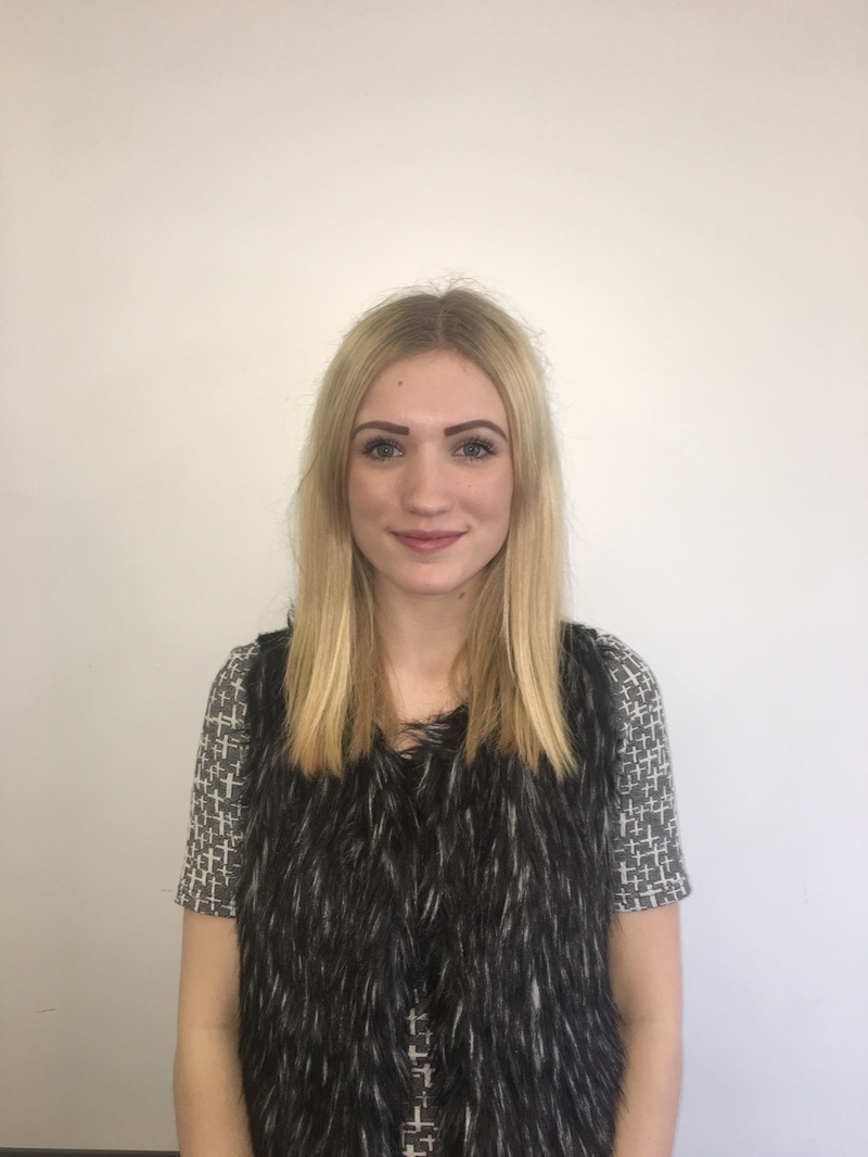
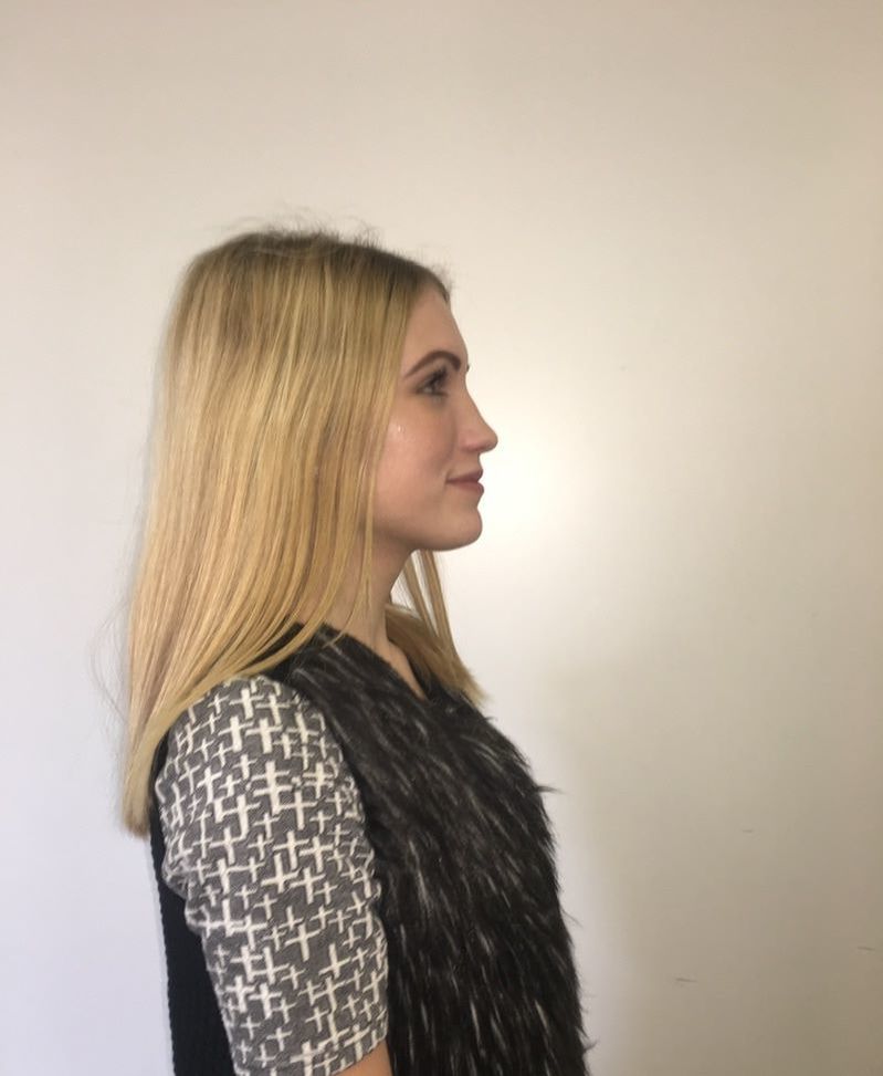
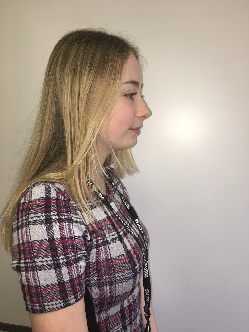
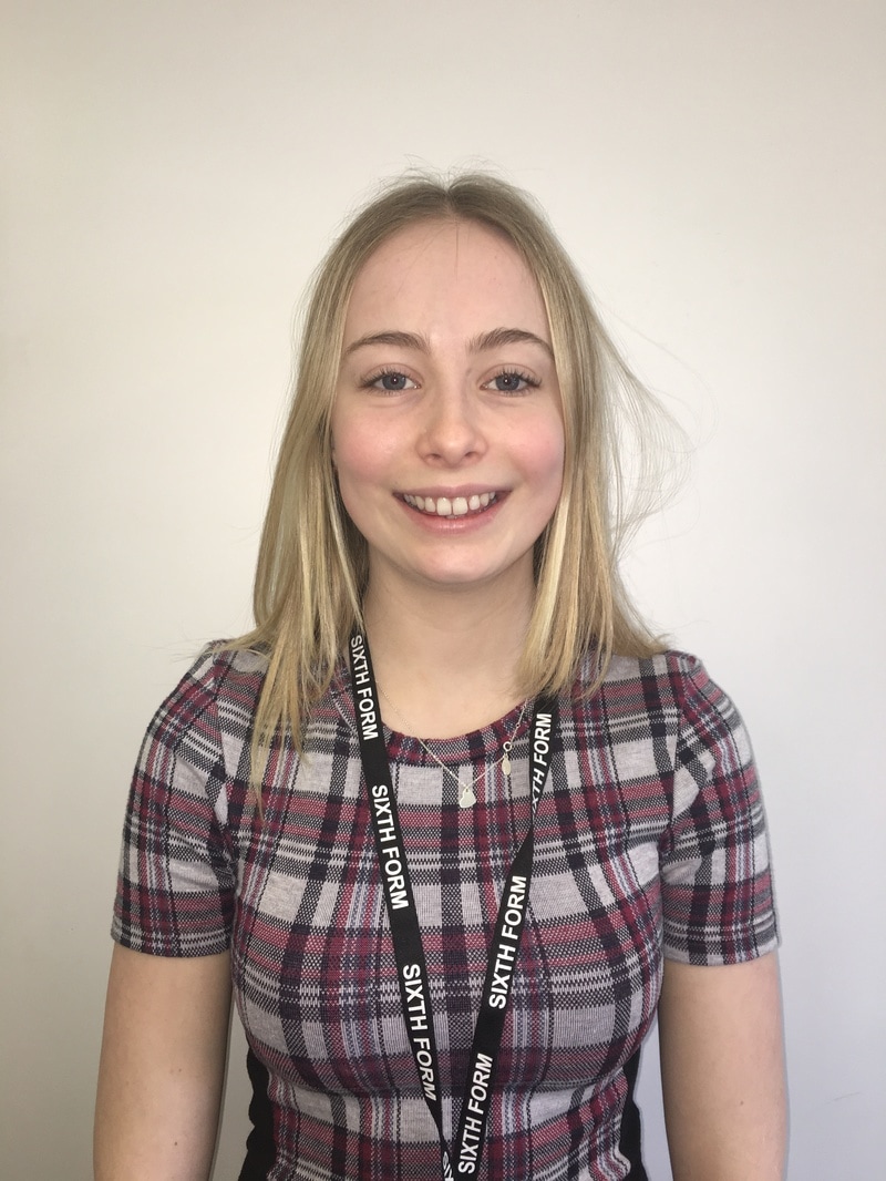
In order to create a magazine, I need to find people who will be willing model and feature in my magazine as a musician. this requires casting "musicians" who could potentially feature in it. I therefore asked a few of my friends if they would be willing to give up there time in order to work with me on my media project. The image of the person is very important as it can give off a lot of information about the type of music genre or the magazine. For example; rock music normally tends to have quite edgy clothing which is black and has elements of punk. Whereas pop music tends to be more casual and fashion which is current and on trend. I also feel that gender and age have an impact on the audience. For example, musicians who are quite young could be more relatable for people who are similar age such as teenagers and young adults. Musician 1: Name: Annabel Still Gender: Female Age: 17 Hair Colour: Blonde Eye Colour: Blue Height: 5"10 Ethnicity: White British My friend Annabel agreed to working with me and allowed me to take many casting shots of her. I found this particularly easy to do as we are good friends so she worked confidently with me. She was willing to give up part of her weekend to take the pictures, this is beneficial as she is very reliable which can make it easy in the future if we was to work together again. I feel that her fashion taste is very current and on trend which can make it very iconic if a young teenager was to see her featured on a front cover, this can make someone want to purchase it.
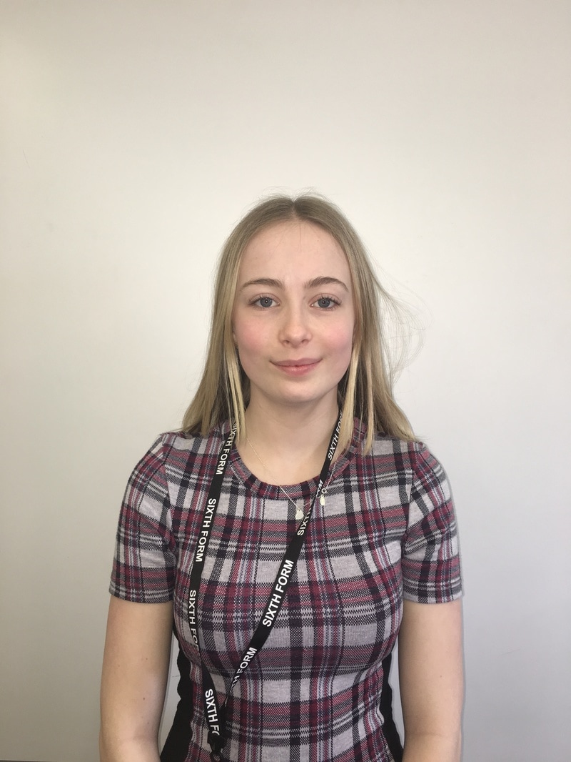
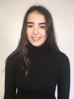
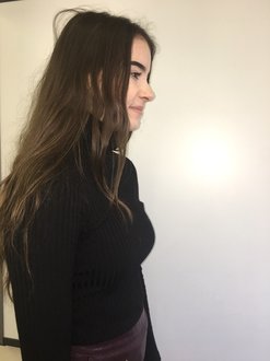
Musician 2: Name: Sydney Cooper Gender: Female Age: 16 Hair Colour: Blonde / Grey Eye Colour: Blue Height: 5"5 Ethnicity: White British Another one of my close friends named Sydney was keen to work with me on my media coursework too. I was lucky enough to meet up with her during half term in order to take some casting photos for my work. I feel as though Sydney would be a good person to be on the cover of my magazine as she is also very confident and doesn't mind her photo being taken. She is also very fashionable which can make the magazine eye catching to teenage girls and make them want to purchase the magazine. Sydney is willing to work with me again which is good as I may need her for my final piece of work.
Musician 3: Name: Emily Saunders Gender: Female Age: 17 Hair Colour: Blonde Eye Colour: Blue Height: 5"3 Ethnicity: White British
Musician 4: Name: Bethany Gough Gender: Female Age: Hair Colour: Blonde Eye Colour: Height: Ethnicity: White British
Musician 5: Name: Rachel Day Gender: Female Age: 16 Hair colour: Brown Eye Colour: Brown Height: 5'10 Ethnicity: White British
For this task I was asked to research potential locations where I can have a photo shoot of pictures of music artists which will feature in my magazine. This is important as the location of the picture can reveal a lot about the magazine and the artist. For example; the shot could be in a popular recognisable location such a London, which could suggest that this is the artists home town. However, if the background is quite plain then it can make the magazine cover stand out and also look more professional. For example, if the shot of the artist is on a plain background then It can be easy to edit the background and change it to different colours.
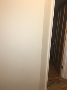
As part of my own research I decided to go out and take photos of potential locations that I could use for the photos featuring in my magazine. 1. Plain Background This is a picture of one of the plain white walls in my house, this can be used as a background for images which may be photo shopped / edited onto other backgrounds. This is easy to use as it doesn't require me or the musician to travel far to take the photos yet the final photo will still look good. It can look very professional taking pictures on a plain background as it doesn't make the picture look messy or confusing. It allows the main focus to be on the musician and not the background. 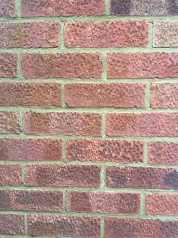
2. Plain Brick Wall This picture is of a plain brick wall, which is one of my potential locations for my backgrounds. I decided to use this as gives off a very urban vibe which suits the pop / rap genre very well. Its easy to access which means it will be convenient if i decide to use this as a background for my final piece. Many photographers use brick walls as backgrounds to give it an edgy feel. 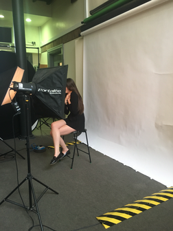
3. Photography background
I decided to use the white background in the technology block as I feel this will make the pictures look professional on a plain white background. Boomerangs of my location shots!
I decided to use the app called 'Boomerang' in order to present my location shots in a creative way. these 3 location shots are potential locations for my photo shoot for my magazine. The boomerangs (from left to right) show:
1. Photography Background in the Technology Block at Langley Girls 2. A plain White Wall at my house 3. A Brick Wall All these locations are easy to access so would be convenient to do the photo shoots in any of these places. Although they are simple backdrops, I feel that the simplicity of the background will have more of an impact on the magazine as it will focus on the music artist. 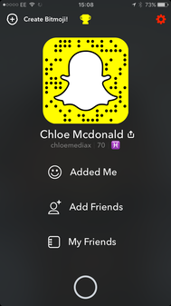
For this task, I had to conduct research about my target audience which will help me when it comes to creating my own magazine. I therefore decided to go about this task in 2 ways. The first method of research I used was a recorded interview. I used my media Snapchat account (Snapchat name - chloemediax) in order to record the responses of the 6 people I interviewed. I found that this was a creative way of representing the data I found as it was using social media which is very popular with this generation. I then saved all the Snapchat story interviews and merged them into one big video on a software called Movie Maker. Below is the final video of my findings using this research method. I asked the following questions: 1. What gender are you? 2. How old are you? 3. What is your favourite music genre? 4. How much would you be willing to spend on a music magazine? 5. What freebies would you like to receive in a music magazine? 6. How often do you buy music magazines? 7. What would appeal to you when purchasing a music magazine? 8. Do you watch music channels? If so which ones? 9. Do you
From this research that I have gathered, I can draw many conclusions which will help me with my own magazine.
All the people I interviewed were around the ages of 12 - 18 years old and had many similar preferences. For example; the majority of the people I interviewed said there favourite genre is pop music, which could suggest that this is a popular choice of music from teenagers. I also found out that many of them are attracted to the magazine if there are music artists of that genre who they enjoy listening too. It also appeared that freebies such as; free concert tickets, head phones and vouchers/ discounts, would attract people to purchasing the magazine. Therefore, I need to ensure there are freebies on offer in my magazine to make my target audience more influenced to buying it. Many people listen to the radio and music channels so as a result of this I could use this as a way to promote my magazine and target audiences who are teenagers and young adults.
My second method of research was by putting together an online survey and asking friends and family members to answer it so I could find out information in further detail. I used a website called 'Type Form' in order to do this. Once the results are collected in, It allows me to log in and look at the data in percentages which gave me a clear understanding of what is popular. I can use the popular choices as inspiration for my own magazine in order to attract the most people to my magazine.
Below is the online survey I asked people to answer, I either sent them the link or made them go onto this page to access it.
Powered byTypeform
Results and Conclusions From My Survey!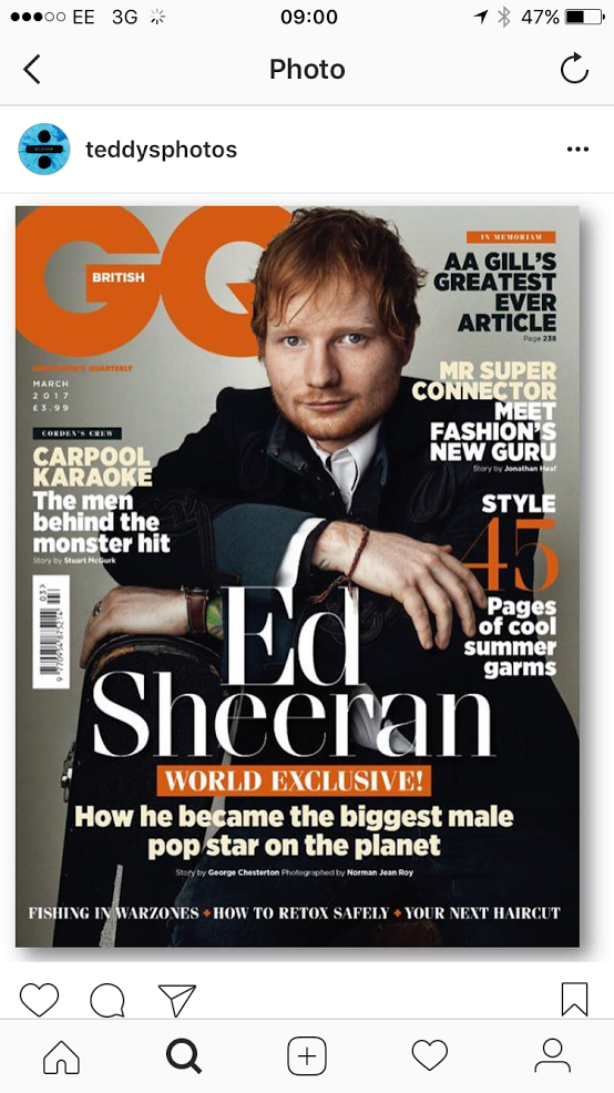 Whilst scrolling through my Instagram feed, I came across this picture that Ed Sheeran (A world famous singer) posted. It was a picture of him featuring on a British music magazine cover. He uses his Instagram which has over 7 million followers in order to promote the magazine. This shows that a magazine will catch the eye of the audience if they have have a well known artist on the cover as it will encourage people to purchase it.
I also used this magazine as inspiration for the layout of my magazine I will be creating in the next few weeks. The colour scheme used matches the overall theme Ed Sheeran uses on his album cover and even merchandise. He emphasises his hair colour in a way which will make his recognisable by using his main logo colours as orange. The magazine looks very sophisticated by the font that is used. however, it is bold at the same time which makes it stand out. You can also tell its quite formal by what Ed Sheeran is wearing in the medium photo shot of him in the front cover. The fact that Ed Sheeran is covering the Mast head, suggests that he is an important figure. The magazine has a clear and organised lay out as it includes sub - headings, a mast head, barcode, price. Overall, I found this magazine very helpful with my research for my own magazine I will be creating in the next few weeks. 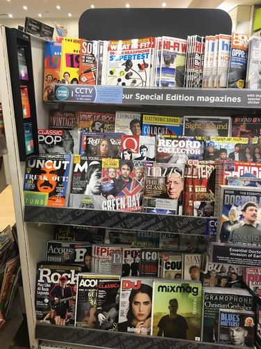 Whilst I was out shopping in Bromley, I decided to pop into W H Smiths to look at the music magazines as part of my research. I took a picture of all the music themed magazines I found in the shop. In my opinion there wasn't much variety as it was all mainly Rock, Heavy Metal and Indie. There was not many Pop or Rap magazines, so I couldn't get much inspiration for my own magazine that I will be creating in the future. However, I did have a look at the way the magazines were layer out and what they contained. This gave me an understanding of what different genres of music magazines look like. In order to present my '25 Word Pitch' I used my iPhone Camera and a feature called Time Lapse in order to speed up my writing. I decided to present it this way as I wanted to be creative and use a range of different ICT. The writing is colourful to represent the theme of the pop genre. I decided to target teenagers and young adults as they are the most popular audience for this particular genre of music. |
AuthorChloe McDonald Archives
April 2017
Categories |
 RSS Feed
