Front Cover Layout Ideas
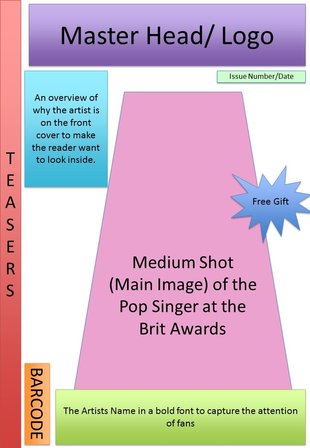
To the left is a layout I created to follow for my own magazine I make. I used power point to create this, as i feel it was easy to move the shapes around and label them to clearly plan out what I wish to do. I wanted to include many conventions of a magazine which I found out in my previous research. For example; a master head, logo, issue number/ date, barcode, teasers, main image, free gift, sub heading, and also headlines.
I feel that behaving a main image on the front cover with a plain background will make the image more effective and eye catching. The teasers on the left hand side will give hints as to what the magazine will include which will gain the readers interest and make them want to purchase and read in further depth. From my survey research that i I carried out earlier, I found that freebies have a massive influence as to whether a person purchases a magazine or not, so therefore i decided to include a freebie in my magazine to make sure my magazine appeals to my target audience and get as popular as possible. The barcode, Issue number and date, is good information to include on the magazine as readers may want to collect the magazines and want to know which issue the magazine is. My master head will stand out as it will be a recognisable magazine brand which will help to sell it and encourage people to pick it up and read it. It will be bold which will instantly attract attention to it. The coloured shapes also represent the fact that my magazine cover will be colourful. Colour is an important part of the 'pop' genre. Colourful magazines also catch peoples eye. Screen Recording Of How I Created My Layout
I created a short video using movie maker in order to show how I made my lay out. I screen recorded myself making the layout on power point as you can see from the video, as I wanted to show it in a way which was more creative.
I was happy with the way that the plan turned out as I made sure I used many key conventions. Contents Page Layout Ideas
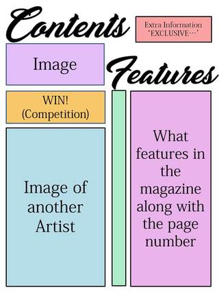
My contents page layout is very clear as to what it features as it gives a list. It is laid out in a simple way. On the right shows my inspiration from other magazines, which helped me when putting together my plan. I used powerpoint shapes and text in order to create my layout plan.
Screen Recording Of How I Created My Contents Page Layout
I created a short video using movie maker in order to show how I made my lay out. I screen recorded myself making the layout on power point as you can see from the video. After doing more researching into contents pages, I decided to make a few changes to my first draft of my layout (The Picture seen above). I did this as I feel it will make it look more professional and also uses more conventions of a contents page.
Double Page Spread Layout Ideas
To the left is a layout I created to follow for my own magazine I make. I used powerpoint to create this, as i feel it was easy to move the shapes around and label them to clearly plan out what I wish to do. I wanted to include many conventions of a magazine which I found out in my previous research.
I added a big picture of my artist as that is what the main article is based on. The article I will be writing will be placed to the right of it with the writers name and details above it, as I noticed a lot of magazines I looked at in my research did this. I also added a quote as it will draw the reader in, and make them want to read the whole article. 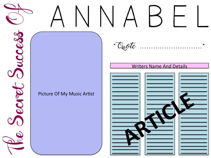
Screen Recording Of How I Created My Double Page Spread Layout
This is the video I made in order to show how I Created my layout plan of my Double Page Spread. i decided to show it using Screen recording in order to be more creative and show how I achieved this plan in greater detail.
To make this plan, I used a software called Power Point, as I found it the easiest method to move around the shapes and change the sizes of the text/shapes. It didn't need to be perfect as it is only a draft, however it is clear to understand as I made sure I labelled it. I did make some changes to my first draft (as seen in the picture above) as I carried out more research and gathered more ideas in ways to make sure my double page spread looks as creative yet professional as possible. I am happy with the way it has turned out as I feel I have included many conventions of a Double Page Spread.
0 Comments
Leave a Reply. |
AuthorChloe McDonald Archives
April 2017
Categories |
 RSS Feed
