|
To help me with my construction of my magazine I made a checklist of the 5 MAIN features I must include on my Front Cover. This is so I can make sure I have the key conventions on my magazine in order for it to look as realistic and professional as possible.
0 Comments
I decided to create a short video using Movie Maker, in order to show the variety of images I took of my friend Annabel during the photo shoot. I did this to display all the images in a creative way and also lead up to decided which of the images I want on my front cover. I will still be using some of the images shown in this video, for my contents page and double page spread, which I will explain later on in my blog posts.
Why I Chose This Image?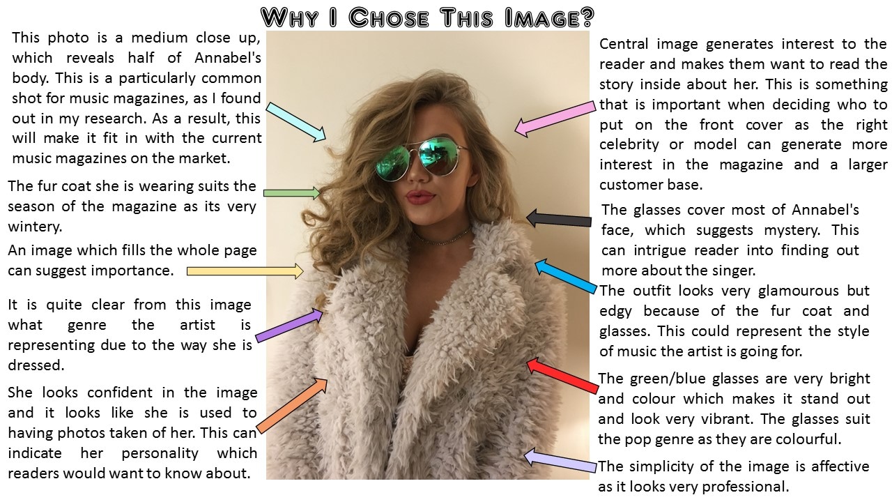
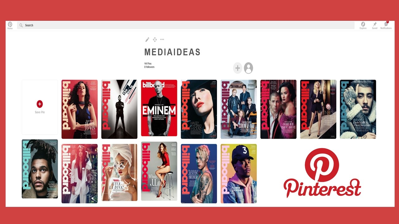
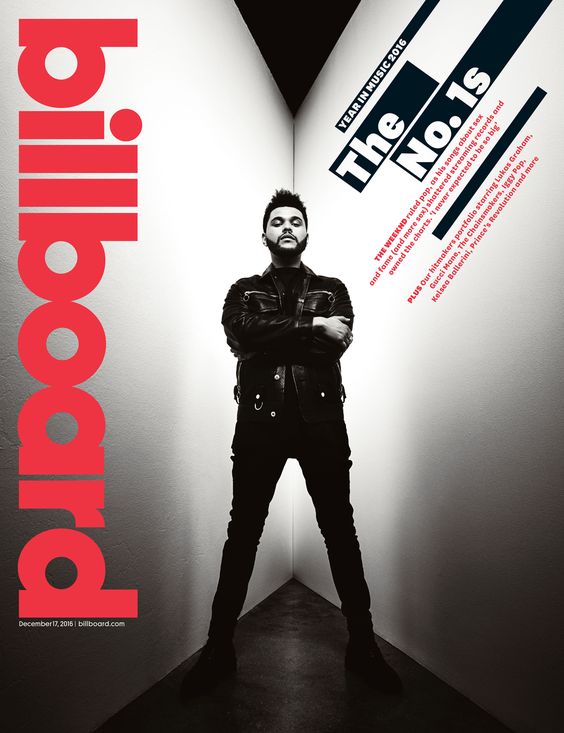
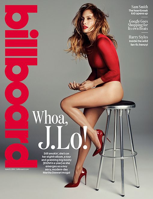
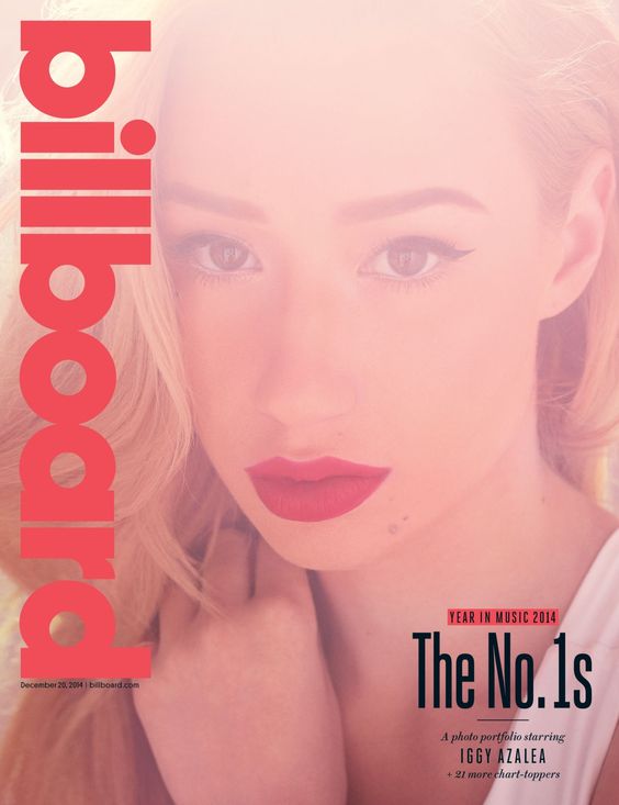
I decided to choose the colour scheme red, black and white, as I feel the bright red colour makes the magazine stand out as its quite a bold, statement colour. The pop genre often use bright colours on the magazine covers so therefore I thought a bold red colour was very appropriate. I also feel that the black and white colours compliment the red well as they don't clash which makes it look more professional. I used the following magazine covers as inspiration whilst constructing my magazine, this helped me a lot as I was able to see which colours are used along side red. This also proves that just despite black and white colours are being used, it can still be associated with the pop genre due to the red which is along side it. The magazines below are all magazines which have pop artists on the front covers and also have the same colour scheme as me. In my opinion I feel this colour scheme is very effective as the red suggest urgency which can catch the readers eye and make them want to pick up the magazine and read it. I am particularly inspired by the first magazine cover (top left) as I really like how the image is black and white and the text is red. It makes the picture stand out as it instantly draws you in.
|
AuthorChloe McDonald Archives
April 2017
Categories |

 RSS Feed
